LinkedIn Pinpoint #847 Hints & Answer: Impact & Courier
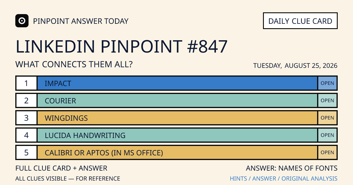
LinkedIn Pinpoint #847 for Tuesday, August 25, 2026 starts with “Impact” and “Courier”. Explore the clues below, then reveal the category and how each clue connects.
Automated explanation · not human reviewed ·
Original game: LinkedIn Pinpoint. Our explanations are independently written; this site is not affiliated with LinkedIn or Microsoft.
Latest edition: Looking for the current puzzle instead? See today's LinkedIn Pinpoint answer →
Reveal answer & analysis
The answer to LinkedIn Pinpoint #847 is “Names of fonts.” Impact, Courier, Wingdings, Lucida Handwriting, and Calibri or Aptos are all typefaces found in familiar desktop and Microsoft Office workflows, even though they range from bold headlines and monospaced text to symbols, script, and everyday document copy.
5 Clues
- Clue 1Impact
- Clue 2Courier
- Clue 3Wingdings
- Clue 4Lucida Handwriting
- Clue 5Calibri or Aptos (in MS Office)
Why this answer fits
Impact and Courier make the strongest early pair because both are instantly recognizable typeface names, but they serve very different jobs: display headlines versus monospaced text. Wingdings then turns the pattern toward installed fonts rather than writing styles, while Lucida Handwriting and Microsoft Office’s Calibri-to-Aptos transition confirm that the clues are font names, not file formats or keyboard tools.
Quick wink: Five fonts walked into one document; Wingdings refused to say anything readable, while Impact insisted on making the headline.
How to find the connection
- Start with Impact and Courier. Both are familiar font names, so typography becomes the leading category even though one is a heavy display face and the other is monospaced.
- Use Wingdings as the confirmation clue. Its glyphs are symbols rather than ordinary letters, but it is still installed and selected like a font, ruling out a narrower category such as readable body typefaces.
- Finish with Lucida Handwriting and Calibri or Aptos. The former imitates informal script, while Calibri and Aptos are associated with Microsoft Office defaults, confirming the broad answer “Names of fonts.”
Clue-by-clue explanation
| Clue | Connection evidence |
|---|---|
| Impact | Impact is a bold, condensed sans-serif display typeface designed to command attention in headlines, posters, labels, and other short pieces of prominent text. |
| Courier | Courier is a monospaced typeface family: every character occupies the same horizontal width, a feature associated with typewriters, code, and tabular text. |
| Wingdings | Wingdings is a symbol typeface whose character positions display pictograms and icons instead of a conventional alphabet, while remaining selectable through a font menu. |
| Lucida Handwriting | Lucida Handwriting is a script-style typeface designed to resemble informal handwritten lettering, with connected forms and a softer appearance than standard body text. |
| Calibri or Aptos (in MS Office) | Calibri served for years as Microsoft Office’s default typeface, while Aptos later became the newer default across Microsoft 365 applications. |
Questions about Pinpoint #847
Which clues start this puzzle?
The first two clues are “Impact” and “Courier”. The complete five-clue list is above.
Where is the category answer?
Open “Reveal answer & analysis” above to see the category and a separate explanation for each clue.
Looking for today's puzzle?
This edition is dated Tuesday, August 25, 2026. Visit today's Pinpoint answer for the latest edition, or browse the archive.
Sources
These references support the explanation notes; they do not certify human review.
- Microsoft Typography — Impact font familyMicrosoft’s typeface record identifies Impact and explains its bold, condensed display design.
- Microsoft Typography — Windows 11 font listMicrosoft’s installed-font inventory lists Calibri and Wingdings as Windows font families.
- Microsoft Typography — AptosMicrosoft identifies Aptos as the new default Office font created to replace Calibri.
 X / Twitter
 LinkedIn
 Reddit